Distant Suns: The new way to look at the sky app good for
Distant Suns, Planets and Star Walk. These are the best app to Sky Watchers.
Wealth of information including amazing images from Hubble space telescope!
As a former user of Distant Suns for Commodore Amiga I could not believe that it could be possible to have that App on the iPhone.
The only thing Im missing is the simulation mode where it would be possible to predict the view of the sky for any date.
Overall 5 stars for the surprise effect!
Thank you!
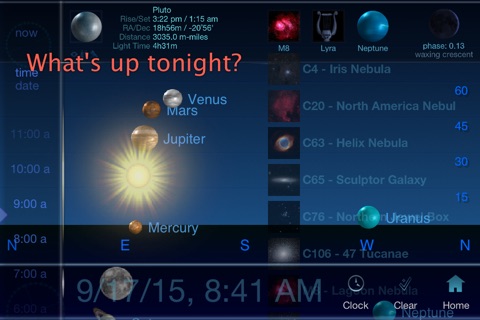
With the recent update, the ability to use any place and time makes this a keeper. A few tweaks and this would be a 5-star application. The Place/time selection is rather cumbersome - a map/crosshair arrangement or even the ability to type in Lat/Long would be an improvement over the silly iPhone spinning wheels. When you change locations via Lat/Long, the time selection creates questions. Is it Zone Time, LMST, DST etc.? Some clarification here would be nice. Some star data seems to be missing (Beta Crux, Gamma Crux for example) and crosshair selection on the Sun and Moon leading to Rise/Set/Phase/Transit data would be nice. But these are all wish-list items that would make a very good planetarium application into a great one.
Distant Sun (lite) is great, but Distant Sun (unleash etc,) is super great! Buy it and have everything an astronomer could ever want, in the palm of your hand everywhere you go! The extras (over lite) are well worth it!
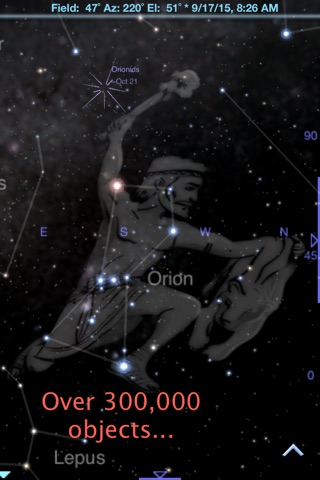
I took a bit of astronomy back in university, but until I got this app it was only really a passing interest. Having a detailed, customizable starmap on my phone, however, has changed everything. The experience of stepping out at night into my own front yard and comparing whats on the screen to whats in the sky, easily being able to spot Mars and Saturn, and following the constellations as they inch westward night after night is almost, for lack of a better word, spiritual.
As for the program itself, its intuitive, well organized and offers a wealth of extra features, from the superfluous to the essential. I especially like the "Figures" option, which brings up the mythological figure associated with whichever constellation you bring to the centre of the screen.
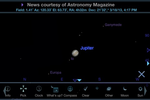
The author has been diligent with updates, and the majority of tweaks over the past few months have been for the better. I do hope future editions will have more detail on the Jovial moons and other objects in the solar system. Id really like to see some integration between this app and the same publishers Grand Tour 3D. It would also be great to have a simplified version for children.
Im considering buying an iPad just so I can experience this software on a bigger screen.
Use this app all the time and never use my Celestron Skyscout anymore :) I allways have my iPhone so find it super handy.
Some bad moments
The program will not scroll at all on my 1g itouch. There is no method to select stars to get alt az or other info. Using Mr Clarkes name to sell a incomplete product seems to tarnish his wonderful memory.
I just got this game today, and after downloading it, it just crashes 2 seconds after I open it. This app is a waste of time.
First item I try is Events, wouldnt you know it, for US only. Deleting app.
Ive never seen worse touch accuracy in an app ever. It makes it nearly impossible to even select a star. Cool idea bad execution
Definitely not easy to use. Its complicated. If you dont want to see constellations, so sad too bad. Youre stuck with it. App is typically very unresponisve on the iPhone 5. No compass or direction calibration. Device quickly loses its calibration. However, app does have potential if developers spend their energy fixing these issues and adding basic options.
Revising my review because, in addition to everything below, with iOS 8, the app does not work very well (i.e. worse than mentioned already, like now compass mode (live tracking) only starts after you randomly go in and out of menus without changing anything, etc).
I’m talking about storage space on my device; this app uses 0.4 GB of space after installing (and that is without adding any of the extra star/etc info), yet competing apps that have all the same data and similar options and display are about one tenth the size. I can’t understand what takes this insane amount of space (other than poor programming/implementation).
In general, I like the app. The screen is rather ‘busy’, and has a steeper learning curve than most, but I prefer the sky display on it to some of the other apps (e.g. things like brightness of planets display more accurately than on other apps). Tons of option settings (though other apps are pretty similar), but bugs there where after rotating device a few times, the settings lowest on the screen can no longer be changed.
Lots of other annoying bugs too, like the option switch bug, the info crosshair showing up in the wrong place, things like the compass directions sometimes showing and sometimes not (i.e. not obeying the ‘clear’ setting), and some of the options not working in both ‘clear’ and non-clear mode, etc.
